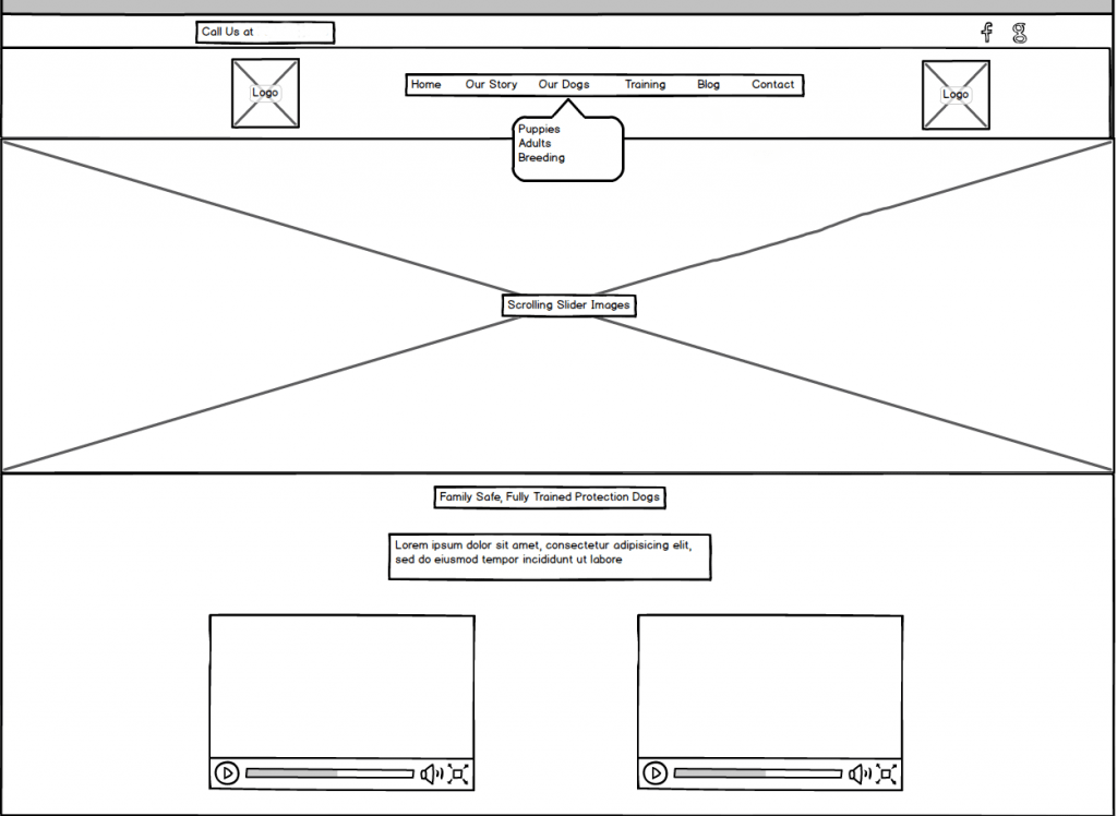
Perhaps one of the most overlooked, but also most important, steps in building a website is the wireframing stage. Wireframes usually consist of black outlines on a white background, with certain symbols (such as a box with an X going through the middle standing for a picture) standing in for future elements (see the picture below).
Although they are meant to be simple, we find that communicating the purpose of a wireframe can get tricky. Clients often get confused by the seemingly industry-centered terms, and tend to think that their website is going to be boring based on what they see in this first stage. While it can difficult to visualize what the final site will look like based on the wireframe, that is actually the point: you shouldn’t be doing that! Do not confuse the wireframe with the website!

Why are they important?
Wireframes exist to make the process easier. They are meant to be a cheap and quick way to discuss potential problems and changes before getting into mockups and the real build of the site, where design changes can mean a great deal of time for the designer. Therefore they are a very important part of the process. However, there is a difference between using them to move the project along, and getting hung up on moving around every little detail 100 times. They should be a quick and dirty way to hash things out, but you also don’t want to be stuck on this part of the cycle forever.
Why does it look so bland and boring?
Wireframes are not design. Repeat with me, wireframes are not design. They are blueprints, outlines, paper napkin scribbles (well, hopefully they’re a bit more sophisticated than that). They are the first step in a long process, meant to start pointing everyone involved in the right direction. They don’t have pretty pictures or bright colors, and they definitely are not supposed to give you a feel for how exciting and impacting the final page will look. There are no design or colors or flashy elements in a wireframe, on purpose. Therefore, just because you are underwhelmed or can’t visualize what the site will look like based on seeing black and white lines, don’t think that the design is going to look horrible. Let the wireframe set the stage for the building blocks of the site, and then give your designer a little trust to make it all come together and look good.
How should we talk about them?
So you’ve gotten a wireframe from your designer and they’ve said, “Hey, let us know what you think of this!” But you aren’t really sure what to say. If you are really unsure, it is probably a good idea to set up a phone call with your designers so that everyone can more easily explain where they are coming from and how everything is supposed to work in the end. However, there are some general do’s and don’ts that can get you started on giving your designer helpful feedback, that will then translate into the website you are looking for.
- DO ask the web designer to explain if you have any questions about what different things are on the wireframe (eg, “what is that long bar that says the words ‘CTA PLACEHOLDER’?”)
- DO give feedback on what items you want in the top menu, and whether you want to have a left menu or a menu at the top of the page.
- DO discuss the layout of what items should go where on the homepage (and whether they should be there at all!) Definitely let your designer know if they missed something important that you know your website needs.
- DON’T ask whether the font size is accurate. Or picture sizing, or anything related to size. Wireframes are not always to scale, and they use generic fonts so that you don’t have to decide what fonts will look good until later on in the process.
- DON’T worry if you think the wireframe looks boring. There is only so much that a wireframe can convey, and it’s not until pictures and colors and graphics are added on top of it that you will have a better feel for what the site will look like.
- And finally, DON’T panic. A great designer will always be willing to walk you through the process helping to answer any questions. All questions asked up front help to save a great deal of time when it comes to moving on to the next step of the project and building you the website of your dreams.
I hope this helps explain wireframes to you a little bit!
